A Comparison of the Three Phases of the High Line, New York City: A Landscape Architect and Photographer’s Perspective
“A Comparison of the Three Phases of the High Line, New York City: A Landscape Architect and Photographer’s Perspective” compares Phase One with Phase Two, and describes what is proposed for Phase Three. Design features to be reviewed include the walk system, seat furnishings, plantings, signage and graphics, water feature and drinking fountains, public art, lighting, maintenance and irrigation, and Phase 3. The author also offers suggestions on economic impacts, restrictions and user activities, sustainability, and studies/research.
Originally, due to the length and photo essay nature of the contribution, the series was presented approximately every few weeks in 14 parts between 2013 and 2015; to ensure background information, the Series Introduction is repeated on all.
Part 4 – Signage and Graphics
By Steven L. Cantor, Landscape Architect – Originally Posted February 6, 2014
All Photos © Steven L. Cantor
Series Introduction
Phase One High Line on July 15, 2009.
Designed by landscape architect James Corner of Field Operations, architect Ricardo Scofidio of Diller Scofidio + Renfro with planting design by Piet Oudolf, the High Line, the remarkable linear park built on an abandoned railroad viaduct in New York City, has been enormously popular.
The design team anticipated how well green roof technology would function and adapt to the viaduct since it could handle at once the huge weight of several fully-loaded trains carrying heavy tonnage. As an intensive green roof, it has very few structural load limits which would curtail use. At peak use times there can be lines of pedestrians waiting to enter with as many as 20,000 visitors per day on weekends.[1]
The High Line has won numerous awards, and in particular several as a green roof, for example, in 2013 and 2010 from the American Society of Landscape Architects, Green Roofs for Healthy Cities in 2011, and in 2010 from the International Green Roof Association. This is a rare public project in which the success of the initial phase contributed to a high level of funding for subsequent phases.
7.16.11.
The High Line has benefited from intense scrutiny as a result of lectures in which the designers were questioned; public hearings, media critiques in newspapers, journals, and blogs; lobbying from specific organizations, such as the Rainforest Coalition; and comments from city government and other public officials.
Improvements or adjustments were implemented to some design elements of the first phase, and significant modifications were done in the second phase. Are these changes aesthetic, appropriate and ethical, and are they consistent with the goals of sustainability? Is the High Line a sustainable design?
Part 4: Signage and Graphics Discussion
Original Phase One signage; 8.03.09.
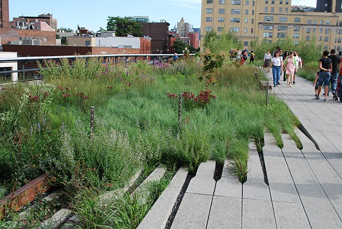
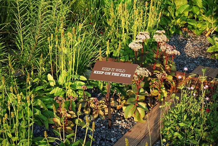
One consistent theme in Phase One of the High Line was the use of signs saying “Keep It Wild, Keep on the Path.” Yet, gradually it became clear to the public and critics that the park is not wild; it is no longer an abandoned viaduct, but a series of extended linear gardens which require a high level of maintenance. It’s a highly managed landscape which, nonetheless, challenges traditional public perceptions of what is beautiful. The grass is not always green.
The interpretation for the public should be clear and accurate, so the text of this somewhat misleading message was changed. No urban coyotes were lurking in the grasses of West Chelsea. When the second phase opened, new signs emphasized: “Protect the Plants, Stay on the Path.” A universal graphic icon is included to indicate the behavior to eliminate. Throughout the park these newer signs have completely supplanted the earlier text.
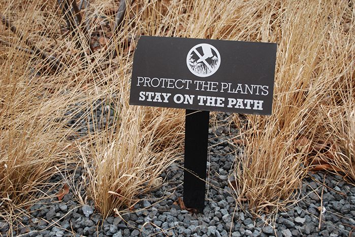
New signs, above on 2.18.12, are clear in warning people to stay out of the planting beds in order to protect the plants.
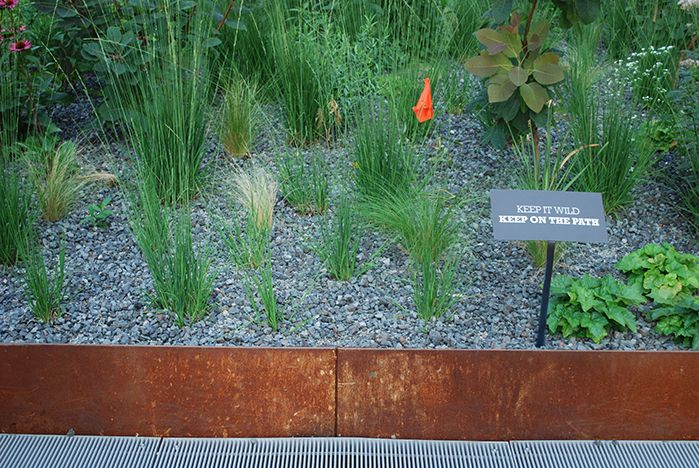
Earlier signs, such as on 8.03.09, featured a different message to protect the “wild” design.
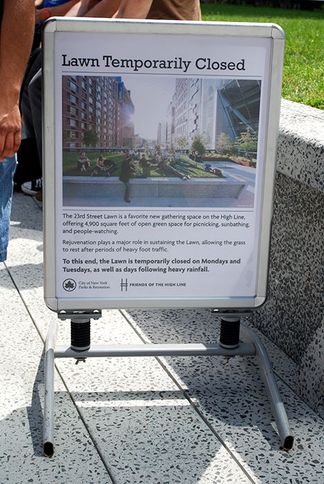
Clear, accurate signs are now used throughout the High Line. Where temporary signage is required, the message is clear and straightforward. For example, the 23rd Street Lawn and Seating Steps, a raised lawn area of 4,900 SF (455.22 square meters), is popular for sunbathing and picnicking, but easily wears out. Large informational signs state, “Rejuvenation plays a major role in sustaining the Lawn, allowing the grass to rest after periods of heavy foot traffic. To this end the Lawn is temporarily closed on Mondays and Tuesdays, and as well as days following heavy rainfall.”
Temporary signage. 6.19.11.
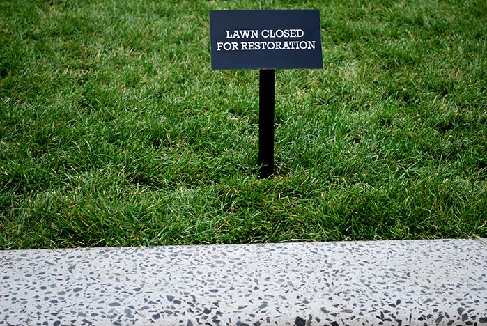
On other occasions, simple signs state, “Closed for Restoration.” In other locations, drinking fountains turned off for the winter are marked “Out of Service for Winter Season.”
6.19.11.
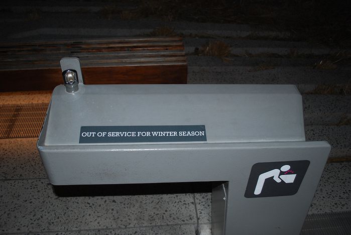
2.18.12.
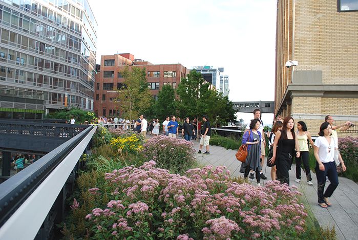
The design team developed interpretive maps and pamphlets highlighting the palette of plant materials and other special features. A large staff of employees hand out pamphlets, maps, plant lists and respond to questions. Some of these are sold at portable booths. From the High Line’s website one can download complete plants lists area by area.
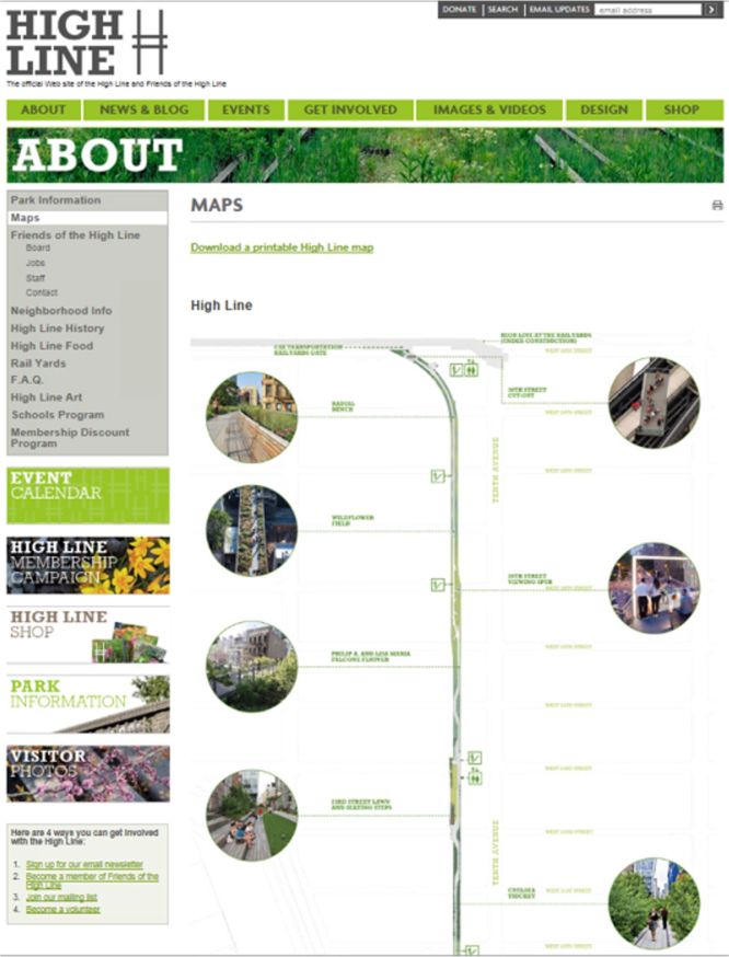
Screenshot of the High Line > About > Maps page – click to visit.
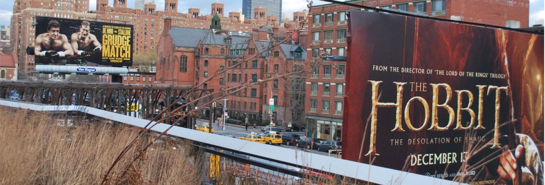
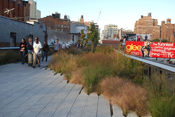
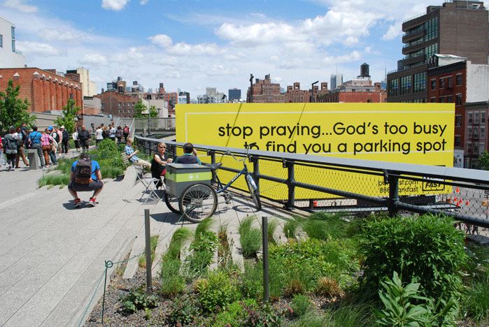
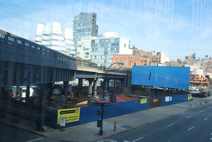
An interesting impact of the High Line is that there are now occasional billboards and other advertising anchored on the streets below, but intended primarily for pedestrians on the High Line, rather than those people (pedestrians, bus and taxi passengers, drivers) in the street itself. Sometimes, the billboard or advertising designs draw upon the color palette of the High Line; at other times, the clash between the landscape colors and the advertising is jarring.
9.25.09.
5.11.12.
There are several locations along the High Line where billboards present dominating visual and advertising images. The most prominent is just north of the Tenth Avenue Square and set above a parking lot. This billboard has become a magnet for different designs by artists.
A progression of billboards farther north along Tenth Avenue offer more traditional ads for movies or other sales pitches. Ironically, the color scheme of two of the most recent billboard advertisements for movies harmonizes with the late fall and winter palette of the High Line.
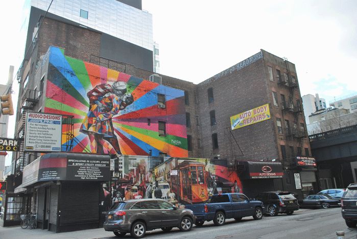
There are a number of murals and ads which can be appreciated from at least two vantage points: from the High Line and from the street below. These art installations help knit the High Line into the emerging fabric of the neighborhood.
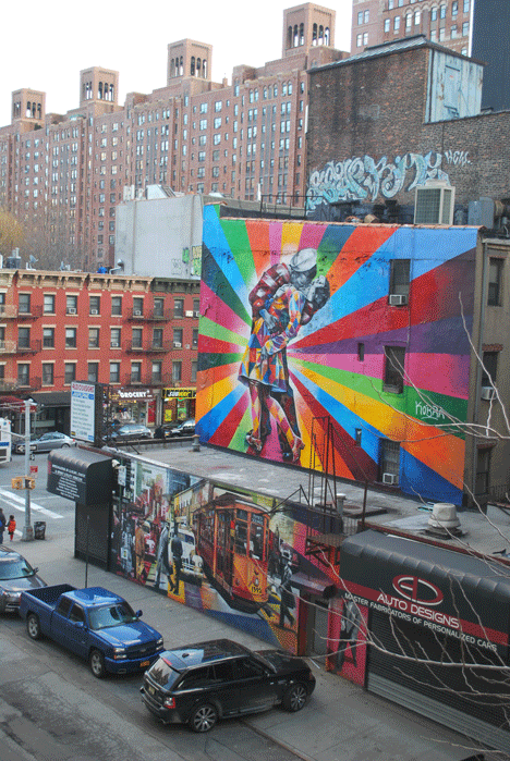
It’s interesting to see how different the same mural or graphic appears from below or above; in the top two we are looking down from The High Line, and the bottom two we’re at street level. 1.12.14.
In Part 6 of my installment I will discuss Public Art, of which there is plenty along the High Line. Yet, the lack of a consistent placement of labels and explanations of the sculptures undermines their effectiveness. Sometimes, plaques are placed nearby and at an appropriate elevation, which encourages pedestrians to stop and inform themselves. In other locations, they are placed at ground level or in an add relation to the sculpture almost as an afterthought, so that there’s not a unified effect.
For example, one conveniently set near the corner of an open plaza has two plaques behind it and underneath the High Line handrail, so that the only way to read them is to walk behind the sculpture and bend over. If one approaches from the left side, there’s a risk of hitting one’s head on the sculpture itself as one stands up.
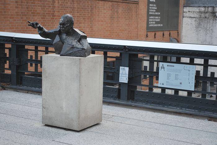
The sculpture is of Colin Powell by Goshika Macuga in the “BUSTED” Series.
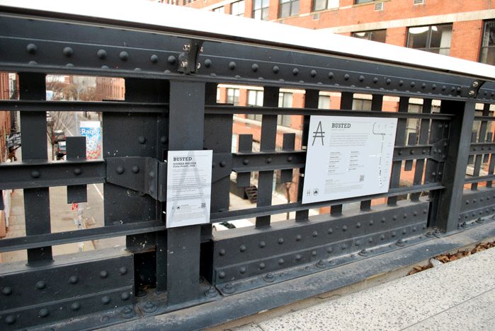
Descriptive signs are under the High Line handrail. 11.30.13.
Billboards, advertisements and messages on display along the High Line route are fully engaged with internet sites. Several new high rise apartment buildings have QR Codes for High Line pedestrians to scan in order to find current information on rentals or purchases. Some buildings have expanded their own outdoor space and included occasional public art as a way of borrowing the High Line as their back yard.
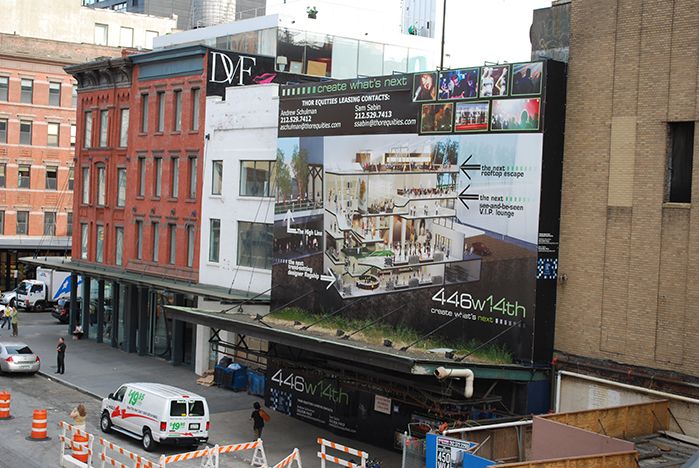
446w 14th advertising their proximity to the High Line, their upcoming “rooftop escape,” and their “see-and-be-seen V.I.P. lounge.” Pedestrians can learn more by scanning the blue and white QR code on the side of the ad. 7.15.09.
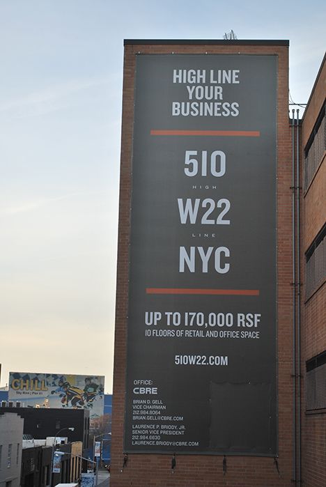
You, too, can “High Line Your Business” with the right signage. 11.30.13.
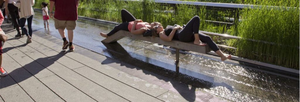
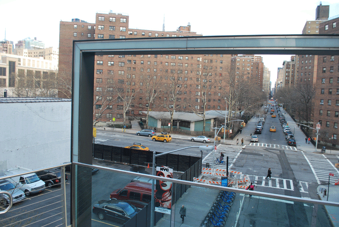
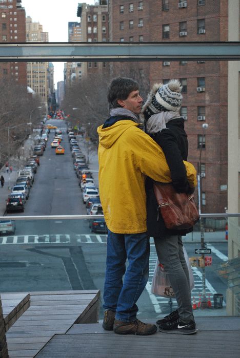
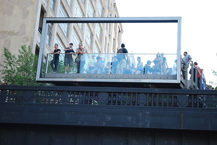
The 26th Street Viewing Spur, set at an angle off the main, linear route of the Flyover, abuts the trestle directly over West 26th Street and terminates with a large bench on a wooden platform which faces an open rectilinear viewport about the size of a billboard.
The designers’ intention is to engage pedestrians in being part of an “advertisement” or game, in which they can stand, pose and look through to the street, perhaps even waving to people below. From West 26th Street looking up, pedestrians on the street see a framed view of the High Line.
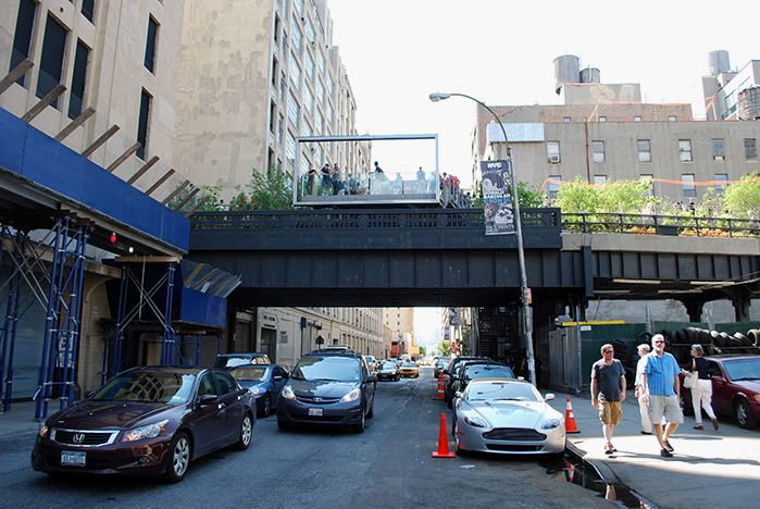
The Viewing Spur’s frame creates a viewport. 6.19.11.
1.12.14.
1.12.14.
6.19.11.
Although the backdrop of this “billboard” is now obscured by temporary scaffolding around one of the many buildings being renovated, it’s still a clear framing device for views of the High Line and immensely popular with visitors.
The scaffolding in foreground is temporary. 11.30.13.
Additional High Line Signage and Graphics Photos
That’s it for now. I hope that these different sections of text and images of the High Line will generate discussion.
Come back next time for Part 5 of “A Comparison of the Three Phases of the High Line, New York City: A Landscape Architect and Photographer’s Perspective” where I’ll discuss Water Feature & Drinking Fountains.
Steven L. Cantor
Photos © Steven L. Cantor are available for individual purchase.
Cumulative 14-part “A Comparison of the Three Phases of the High Line, New York City: A Landscape Architect and Photographer’s Perspective” Series End-notes
1. Ulam, Alex. “Back on Track,” Landscape Architecture Magazine. Volume 99, No. 10, October, 2009, p. 97.
2. http://www.thehighline.org/news/2012/01/24/major-milestone-for-the-high-line-at-the-rail-yards
3. http://www.thehighline.org/sustainability
4. http://www.thehighline.org/design/planting
Publisher’s Note:
See Steven L. Cantor’s ENTIRE 14-part “A Comparison of the Three Phases of the High Line, New York City: A Landscape Architect and Photographer’s Perspective” Series.
Steven L. Cantor, Landscape Architect

Photo by Thomas Riis.
Steven L. Cantor is a registered Landscape Architect in New York and Georgia with a Master’s degree in Landscape Architecture from the University of Massachusetts, Amherst. He first became interested in landscape architecture while earning a BA at Columbia College (NYC) as a music major. He was a professor at the School of Environmental Design, University of Georgia, Athens, teaching a range of courses in design and construction in both the undergraduate and graduate programs. During a period when he earned a Master’s Degree in Piano in accompanying, he was also a visiting professor at the College of Environmental Design at the University of Colorado, Boulder. He has also taught periodically at the New York Botanical Garden (Bronx) and was a visiting professor at Anhalt University, Bernberg, Germany.
He has worked for over three decades in private practice with firms in Atlanta, GA and New York City, NY, on a diverse range of private development and public works projects throughout the eastern United States: parks, streetscapes, historic preservation applications, residential estates, public housing, industrial parks, environmental impact assessment, parkways, cemeteries, roof gardens, institutions, playgrounds, and many others.
Steven has written widely about landscape architecture practice, including two books that survey projects: Innovative Design Solutions in Landscape Architecture and Contemporary Trends in Landscape Architecture (Van Nostrand Reinhold, John Wiley & Sons, 1997). His book Green Roofs in Sustainable Landscape Design (WW Norton, 2008), provides definitions of the types of green roofs and sustainable design, studies European models, and focuses on detailed case studies of diverse green roof projects throughout North America. In 2010 the green roofs book was one of thirty-five nominees for the 11th annual literature award by the international membership of The Council on Botanical & Horticultural Libraries for its “outstanding contribution to the literature of horticulture or botany.”
Steven’s most recent book is Professional and Practical Considerations for Landscape Design (Oxford University Press, 2020) where he explains the field of landscape architecture, outlining with authority how to turn drawings of designs into creative, purposeful, and striking landscapes and landforms in today’s world.
He has been a regular attendee and contributor at various ASLA, green roofs and other conferences in landscape architecture topics.
In recent years Steven has had more time for music activities, as a solo pianist and accompanist. In 2011 he performed a solo piano program at the Winter Rhythms festival at Urban Stages Theater. He’s a regular performer at musicales hosted in Chelsea and other settings in Manhattan. On August 25, 2013, Leonard Bernstein’s birthday, he performed with Stephen Kennedy Murphy a program of excerpts from the composer’s MASS and Anniversaries.
Steven joined the Greenroofs.com editorial team in December, 2013 as the Landscape Editor. In February, 2015 he completed his 14-part series “A Comparison of the Three Phases of the High Line, New York City: A Landscape Architect and Photographer’s Perspective.”